
For anyone following the NHL, and specifically the news concerning releases of new jersey styles, this award should come as no surprise, as the 2011-12 New York Islanders Alternate Jersey is the Third String Goalie Turkey of the Year.

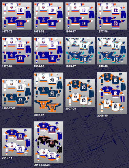
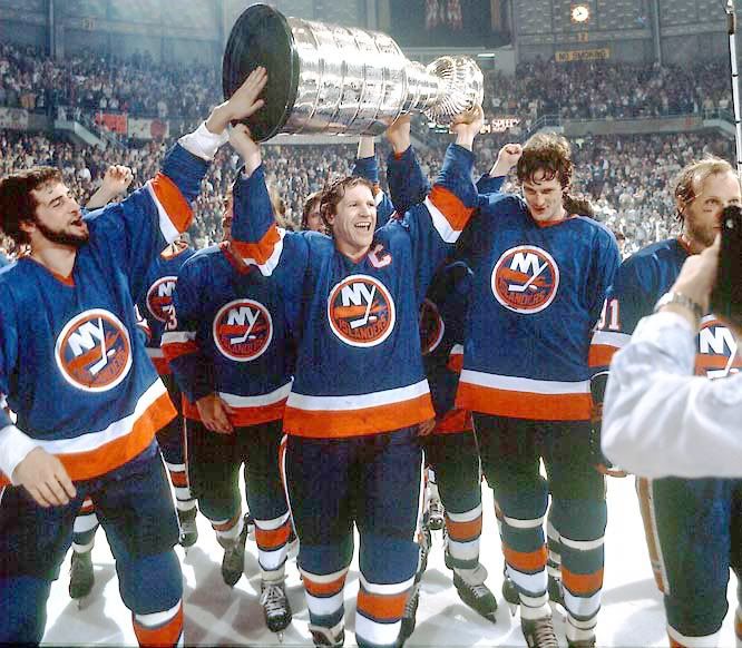
There is so much wrong with this jersey it's not even funny. The main issue being that the jersey is black - which is not one of the Islanders colors. Yes, just as the orange and blue clad New York Mets finally eliminate the extraneous black from their jerseys, it makes the 20 mile drive to the Nassau County Coliseum to invade the Islanders color palette. Not once in the 40 year history of the Islanders has black ever appeared on one of their jerseys. Not during their formative years or subsequent Stanley Cup Dynasty, not during the unfortunate fisherman era, the construction worker vest period. Never, ever - in any way - until it now takes over an entire jersey.

The main cresting of the jersey is also an unexplainable choice of the name "Islanders" in an incredibly generic font, arched over the player number despite the continued criticism the Dallas Stars jerseys have received for the same look for the last four seasons.

There's just nothing about it that generates any excitement or connection to the franchise. It's as generic a treatment as any jersey in NHL history and looks as if it were designed by someone without a license to use copyrighted NHL team logos! We've see so many creative and great looking concept jerseys and logos designed by fans which used a lighthouse logo for the main crest or an updated version of the "NY" incorporating a stick that to just slap the team name on the front without even using something that ties in with the club's identity package seems inexcusable.
Speaking of the club's identity package, the team also chose to employ a different font for both the name on the back as well as the number, bypassing the chance to maintain any continuity across the full set of home, road and alt jerseys.
Additionally, the choice of three colors for the names does not help their legibility. Very few teams use three color names, and a few who did have chosen to simplify them to two color names to make them easier to read. About the only saving grace is that the royal blue is the outer color, and when placed on the black it's indiscernible from any distance, essentially reducing the names to two colors anyway.

Speaking of continuity, where's the 40th Anniversary patch worn on the home and road jerseys? Details, people, details!
In addition to our complaint about the fact the jersey is black, we also have an issue with the grey shoulders and striping, another color not used on the Islanders home and road jerseys. using white instead would have at least fit in with the three colors of the home and road jerseys. As it is, the black and grey just create a seriously depressing overall feel when paired with the mid-toned shade of royal blue.
An early leak of one of the other nine proposed designs had white substituted for the grey and it feels much less depressing, especially when combined with the blue pants with the vertical striping, rather than the awful "hip diamond" mess they went with.

With the Islanders having chosen to produce a black jersey with grey shoulders and zoomy striping that comes to a point on both the sides and arms of the jersey, creating a futuristic "Star Trek" look, what do they choose to do next? A vintage, old-school lace up collar! This was a terrible, terrible choice, as it does not fit with any aspect of the jersey in any way and adds nothing to the look. The jersey would look so much cleaner without it, and it has no business being on a jersey that looks like a "turn ahead the clock" jersey. Just awful.
Terry Goldstein, the Islanders Director of Retail Operations, said "We view this as just a fun, alternative jersey. With our white and our blue jerseys we look back at our history, and with the black jerseys, we're looking forward."
So why does it have an old-fashioned lace up collar?!
Beyond the jersey, the pants they designed to pair with the jersey have an inverted triangle shape, which creates a asymmetrical diamond shape with the corresponding, longer triangle that runs up the sides of the jerseys, another jarringly bad decision, especially in light of the fact the two triangles are not the same width were they meet.

Notice the vapors coming off the player in this photo which we have identified as the smell coming from this absolute stinker of a jersey.
"The jersey has to fit the personality of the team," Goldstein continued. "Currently, the personality of our team and our fans is that they love the traditional royal and white and we're not changing that for a long time, but on a couple of games we wanted to have some fun with something different."
It's too bad they created a depressing jersey instead of a fun one. They did, however, create a jersey which fits the personality of the team - poorly thought out, disorganized and a real mood killer, flat out the worst one we've seen since the 1996 arrival of the Mighty Ducks Wild Wing jersey 16 years ago.
This jersey is so awful, the players appear to be trying to cover up as much of the jersey as possible in the photos of it's release! We've never seen anything quite like it before.

Wait a minute... we have seen it before! This is a "hockey jersey" from the NBA's Toronto Raptors, which can be found on ebay, and appears to be the inspiration for the Islanders new jersey.


Today's videos begin with the public debut of the jerseys, as modeled by the Islanders players, who toe the company line with their praise of the new alternates.
Here is footage from the jerseys in action, where the "diamond" shape made up of the triangle shapes on the jerseys and pants looks truly awful when on the ice.
No doubt we've made our opinion on the Islanders new jersey quite clear, but we'll let the ultimate authority have the final word today.


No comments:
Post a Comment
We welcome and encourage genuine comments and corrections from our readers. Please no spam. It will not be approved and never seen.