As a reminder, some very basic rules we used were to use an online bracket creator to randomly seed all 86 NHL jerseys used this season as documented by NHLUniforms.com, leaving out any one time only jerseys such as those worn in the Winter or Heritage Classic, giving the top 16 seeds in random order to the Original 6. Beyond that, we let the chips fall where they may. Now, on to the competition!

Matchup #1 of the Sweet 16 is #1 the Chicago Blackhawks Alternate against #16 the Toronto Maple Leafs Home jersey. The Blackhawks win due to their three colors, black, red and off white, which elevates them above the Maple Leafs two color jersey. Chicago's central stripe around the body adds even more visual interest, tipping the scales to the Blackhawks.

Matchup #2 gives us #8 the Chicago Blackhawks Road jersey taking on #9 the Toronto Maple Leafs Alternate jersey in another Chicago vs. Toronto meeting. Tough to call, but we're going to give this one to the Maple Leafs in overtime. Toronto's excellent use of this jersey for special occasions on the ice, such as the annual Hockey Hall of Fame Game, shows the rest of the league how a third jersey should be used. Add in the blue shoulders and the Leafs eek out a close one over a true classic.


Matchup #4 sees #28 the Los Angeles Kings Vintage jersey taking on #12 the New York Rangers Home jersey. Similar to the previous battle, the Rangers red, white and blue jumps out at you more than the Kings darker purple and elemental gold stripes. There's a reason the Rangers jersey has been around so long, and a reason the Kings moved on from their original jerseys. Rangers advance.

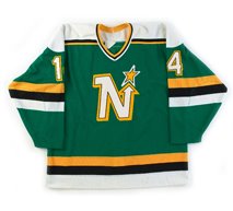
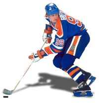
Matchup #5 pairs #66 the Edmonton Oilers Home jersey and #82 the Minnesota Wild Home sweaters. It's time to face the facts. If the Oilers had not won five Stanley Cups in this jersey, it would not be as revered. Bluntly, blue and orange trimmed in white is a rather garish color scheme and Minnesota prevails in this battle.

Matchup #6 sees #71 the Washington Capitals Home jersey paired against #10 the New York Rangers Road jersey. The clock strikes midnight for the Capitals new fangled Reebok piping-heavy Edge jersey in the face of the Rangers road jersey with it's unique shoulder striping and classic diagonal cresting.

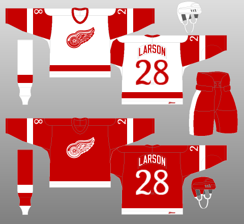
Matchup #7 pairs #3 the Detroit Red Wings Road jersey against #14 the Montreal Canadiens Home jersey. Montreal's blue chest and arm stripes add a punch of contrast to the Habs long time jerseys giving them the win over Detroit's classic sweaters. A strong matchup to be certain, but a regulation win for the Canadiens.

Matchup #8 sees #15 the Minnesota Wild Alternate jersey taking on #11 the New York Rangers Alternate jersey. A tough one for two similar jerseys. Diagonal from left to right, or right to left? Both sweaters use off-white for a retro feel and have lace up collars for an added touch. In the end, Minnesota's jersey falls short because we feel it needed a shot of red, preferably around the upper arms where the sleeve numbers are placed. We also like the Rangers striping style a bit more when compared to the Wild's single wide stripe with a smaller stripe of the same color just above.

The Elite 8 now move on to the quarterfinals in Round 5, which kicks off with a heavyweight slugfest in Matchup #1 with #1 the Chicago Blackhawks Alternate against #9 the Toronto Maple Leafs Alternate jersey in another Chicago vs. Toronto meeting. Things really start getting tough at this point. The two jerseys have similar considerations with their vintage themes, and while the Maple Leafs jersey is a fantastic sweater, the striking color scheme of the Blackhawks carries the day in a close fight.

Things do not get any easier with Matchup #2 as #13 the Chicago Blackhawks Home jersey squares off against #12 the New York Rangers Home jersey. Both teams have great color schemes . The Rangers get huge points for their diagonal lettering, which has influenced jerseys from the early days of the NHL right though to today, while the Blackhawks score points for their great secondary crossed tomahawks secondary logos, which the Rangers jersey lacks. Both have similar striping patterns while New York has a lace up collar which Chicago does not. In double overtime, your winner based on having secondary logos, which makes for a more complete package, is the Blackhawks.

Matchup #3 is another slugfest with #82 the Minnesota Wild Home sweaters paired against #10 the New York Rangers Road jersey. Holding up the honor of the rest of the league against the Original 6, Minnesota prevails due to our bias against white jerseys when compared to their colorful dark jerseys. No jersey has created a brand for it's club more than Minnesota's excellent faux-back.

Matchup #7 pairs #14 the Montreal Canadiens Home jersey against #11 the New York Rangers Alternate jersey. While New York puts up a good fight, the overall look is rather dark and the retro "New York " font on the front is beyond plain, rather easily tipping the scales to the Canadiens brighter look. Montreal moves on.

The semifinals begin with an all Chicago matchup as #1 the Chicago Blackhawks Alternate take on #13 the Chicago Blackhawks Home jersey. The home jersey loses points since the arm striping pattern does not match the waist striping. Additionally, the alternate's more sinister coloring makes even the smallest of their players seem bigger on the ice. The central chest stripe is a bold statement done in off-white which really draws your attention to the incredible main logo while the lace up collar really completes the package as the alternate moves on to the finals.

The second semifinal pairs #82 the Minnesota Wild Home jersey paired against #14 the Montreal Canadiens Home jersey. We love the Wild home jersey, but in the end we have a few too many nit-picks for it to defeat Montreal. We never embraced the abrupt way the sleeves of the original version met the body, something that was actually improved on with the Reebok Edge version, as the red shoulder area now carries down into the green space like the white shoulders of the road Red Wings jersey takes a bite out of the top of the red sleeves. Still, the first time we saw these jerseys we thought that a central green chest stripe would have been a perfect addition and against the Wild jerseys above all else, the font for the numbers is one of the worst in the league and a huge missed opportunity. A much more retro looking font, like the one used by Detroit for one season in 1982-83 or even better the New York Rangers drop shadowed numbers would have been ideal. Unless you bring your complete "A" game, you cannot beat the Montreal Canadiens at their own game, and the Habs move on to the finals as the last of the non-Orignal 6 falls.

It all comes down to the #1 the Chicago Blackhawks Alternate versus #14 the Montreal Canadiens Home jersey. While the Blackhawks jersey has secondary logos and a lace up collar, there's just something about the iconic Canadiens jersey which just appeals to us more. The width of the central stripe on Chicago's jersey just seems too wide after a lifetime of having the Canadiens jersey set the standard.
The dark circle around the smaller size Indian head compresses the size, making the details a bit harder to make out, while the bolder Montreal "CH" logo jumps out at you quite easily and some points gained by the Blackhawks secondary logo are tempered by it's thinner size compared to the current version worn on the home and away jerseys.
In the end, the title of the Best Jersey in the NHL goes to the oldest jersey in the NHL, as the Canadiens iconic red sweater with it's blue central chest band dates back to 1912 when it was first introduced as an alternate jersey to be worn against the Ottawa Senators, as both clubs were wearing multi-striped barberpole jerseys at the time.
The sweater was adopted full time for the following season of 1913-14 with a "CA" logo (for Canadien Athletic Club) and white trim now separating the blue stripe from the red body. The central chest stripe was repeated on the arms beginning in 1915. The "CA" logo evolved into the "CH" logo after a change in ownership in 1916-17, which also saw the blue and white stripes appear together at the bottom of the jersey for the first time, creating essentially the jersey they have worn ever since.
Details may have changed over time with outlines around the logo and various collar striping tweaks and the comings and goings of lace up or v-neck collars, but the jersey has remained the iconic jersey in the game of hockey, if not all of sports, influencing many other hockey sweaters since. The club has remained true to it's design over time, including holding their ground against the revolutionary change to the Reebok Edge jerseys, which saw the elimination of many team's waist striping. The jersey also has the distinction of having been worn by numerous Hockey Hall of Famers who have captured 24 Stanley Cups dating back to 1916, by far the most of any franchise.

Canadiens legends Jean Beliveau, Maurice Richard and Guy Lafleur model the Canadiens famous red sweaters while celebrating the club's many Stanley Cups
Congratulation to the Montreal Canadiens iconic home sweaters, the winner of the 2011 Third String Goalie Jersey Bracket and thanks to you for reading and we hope you enjoyed the tournament.


Congratulations for putting up this tournament, a wonderful idea. I really enjoyed it!
ReplyDeleteThe Blackhawks alternate is good, but not as good as the home jersey. Had it come down to it, the Hawks home jersey would beat out the Canadiens home jersey. There's been polls of the best jersey across all sports and the Blackhawks have come out on top.
ReplyDelete