Friday, August 20, 2010
1997-98 University of Minnesota Golden Gophers Erik Rasmussen Jersey
The Curious, Weird and Ugly™ Collection now features a college jersey from the WCHA.
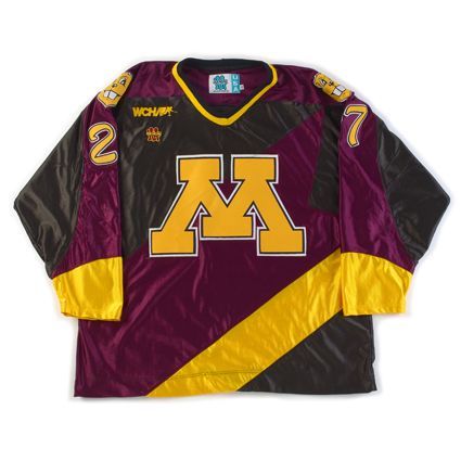
This hideous nightmare of a jersey is a 1997-98 University of Minnesota Alternate Erik Rassmussen jersey.
Designed by then Golden Gophers player Casey Hankinson, and crafted entirely out of "dazzle cloth" by Gemini Athletic Wear, this jersey features the traditional "M" logo, but the similarities between it and the regular Gophers home and away jerseys ends there.
The torso has diagonal black, a very purplish shade of maroon, bright gold and black bands of color, of unequal widths of course. Even weirder is the black extension of the left arm coloring into the upper left chest area. What is the reason for that? It looks like a crude patch sewn to repair some imaginary game worn tear.
The maroon shoulder coloring runs down the top of the sleeves until wrapping around the arms just above the bright yellow cuffs and over the black coloring on the lower part of the arms. It's a grotesque patchwork quilt of lines running this way and that in dark and depressing colors only broken up by jarring flashes of gold - all with a glitzy shine that makes the entire package all the more tacky.
But that's only the front of the jersey. Taking a look at the shoulders gives us the bizarre sight of the severed head of Goldy Gopher smiling away, completely oblivious to the ghastly scene unfolding beneath him.
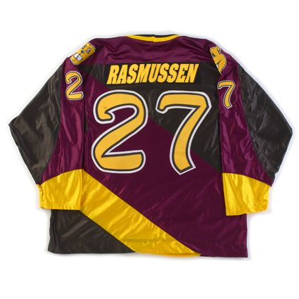
The tacky, bloated font for the names are italicized for no apparent reason other than to contradict the direction of the diagonal lines leaning the opposite direction on the back of the jersey, and are placed on an ill-advised, italicized(!) dazzle cloth name plate that overlaps into the purple maroon area of the jersey if the name is of sufficient length.
Topping off the whole package is the just plain ridiculous font for the numbers, done in three colors to mimic the "M" on the front. The numbers are an unexplainable combination of calligraphy and the Flintstones, appearing hand-drawn, yet crude at the same time.
The Gophers wore this jersey for only a few games, perhaps even only just once as we have also heard, because the players rightfully thought they were dreadful and no longer wanted to wear them. Replica versions do periodically show up on ebay, but you better have an expert customizer on your side to recreate the name and numbers worn on this one.
We classify this jersey to be "Curious", as in we're curious what the approval process for this trainwreck was really like, "Weird" due to the appalling pattern of the diagonally striped construction of the body and simply terrible font for the numbers, and "Ugly" because it is, without hesitation, the worst looking jersey in the Third String Goalie collection.
It's truly "the perfect storm" of bad ideas poorly executed.
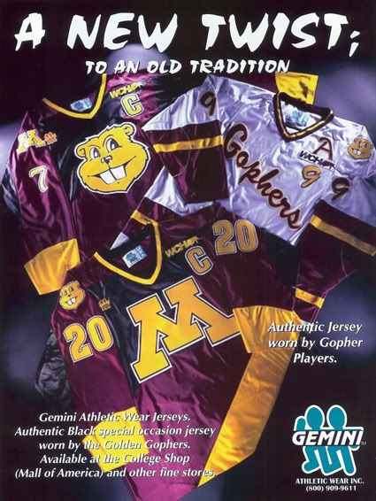
But if you think that the jersey worn on the ice was bad, check out this ad for Gemini that shows an unused prototype variation featruing a giant Goldy Gopher head as the main logo, which takes the entire package to an entirely new farcical level!
If the "Gopher Head" version actually been worn, we can only imagine that they would have been the second ever jersey to be rejected during a game.
Subscribe to:
Post Comments (Atom)





TSG,
ReplyDeleteI'm sure the jersey had nothing to do with the GG finishing 6th in the WCHA that year. I heard the Goldy logo was thought up to instill fear in the minds of opponents, but couldn't get the approval in time to help turn their season around. Too bad, the jersey refracted light and made the gophers look like they were dancing in a discotheque rather than attempting to play hockey, which would have kept their rabid fans enthralled when their play didn't. (Pardon me, the gopher fans have the highest IQ in the country, every time one of their players is released after a penalty, the incarceration confusion invokes a spontaneous response of "always were" to the pa announcing full strength. Kind of like an infant uttering its first spoken word, funny and silly at first, and eventually embarrassing when repeated ad nauseam.)
Hey man, just wanted to stop through and say I really enjoyed reading your blog. I think those Minny Gopher jerseys are bad, but the Minny Wild jerseys over the years have been worse. Anyway, keep up the good work. :D
ReplyDelete